This article will walk you through the decision process the marketing team went through to update THORChain's logos. These logos are not final but we do feel strongly this is the way to go. We want to run this by the community first to get constructive feedback before moving forward. We don't want this to turn into a Jaguar or Cracker Barrel rebrand and alienate our own audience. We’re seeking broad community support before we run with these or something similar.
Background
For the better part of 2025, many people in the community were calling for THORChain to be rebranded. First, to distance ourselves from THORFi and the ByBit hack. Second, to distance ourselves from THORSwap and THORWallet who have similar branding and are often confused as the official front ends for THORChain.
A full rebrand (new name and logo) is an expensive and long process to do properly. It would take a lot of research and money to come up with a new concept. And we run the risk of alienating our existing audience because there will always be some people who disagree (even the logos below might elicit a negative response). There's a lot of sunk capital into memes, profile pictures, Twitter handles, and more that would all of a sudden become obsolete with a full rebrand. And trying to distance ourselves from the past by rebranding could be perceived as a cheap gimmick and backfire.
In the past, the THORChain community would refer people to THORSwap and THORWallet because they were one of the only ways to "use THORChain." But this isn’t an issue anymore because THORChain has its own swap interface now. Therefore, there isn’t a need to distance ourselves anymore and instead we can work as partners going forward.
Rather than be upset with THORSwap and THORWallet having a similar logo to THORChain, we should be happy about it.
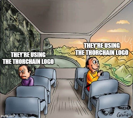
It’s every brand's dream to have their logo splashed all over the place. Check out these Nike swoosh tattoos. You know your marketing has reached god tier status when people are getting your logo permanently etched onto their body. Do you think Nike is stressing out about these people copying their logo?
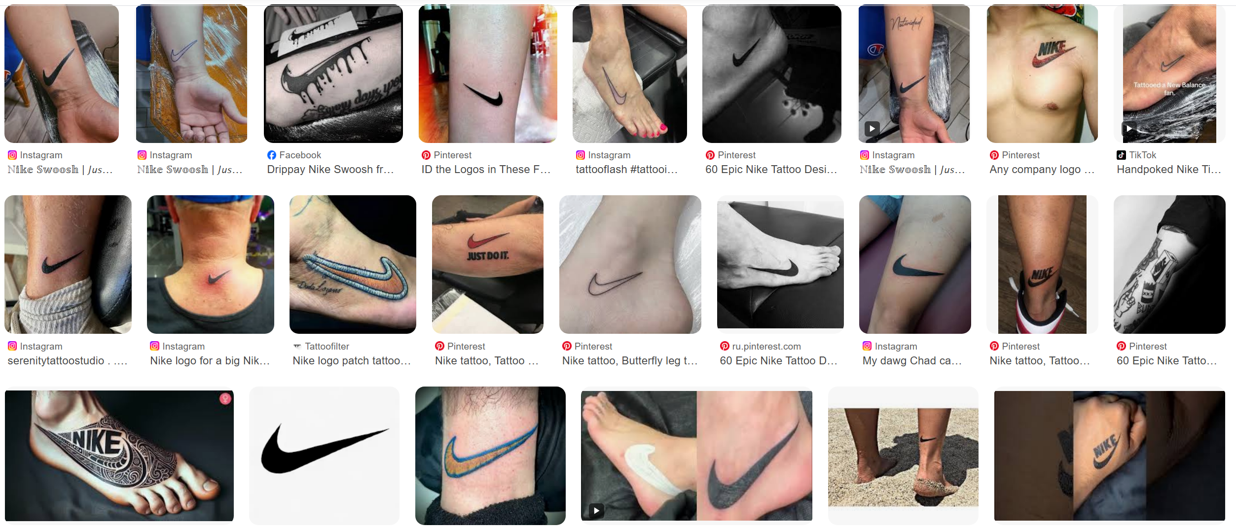
The THORChain community should be ecstatic that other projects want to copy the lightning bolt logo. It means they see value in the THORChain brand. Despite everything that’s happened over the past year, THORWallet and THORSwap still carry the lightning bolt logo and they’re still valued partners of THORChain.
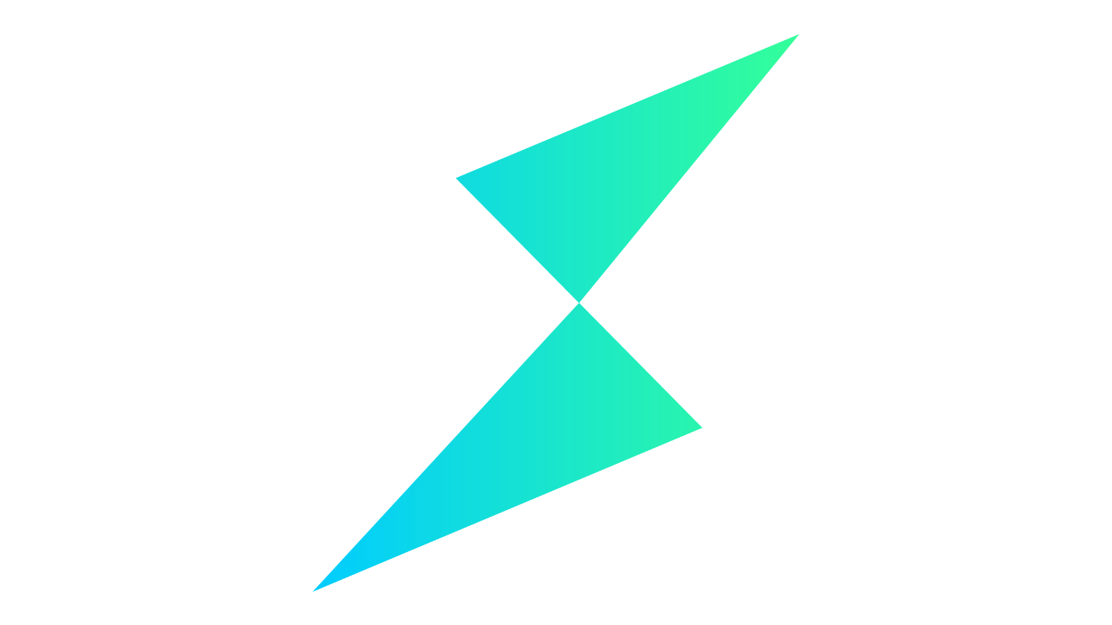
The Lightning Bolt is THORChain’s Logo
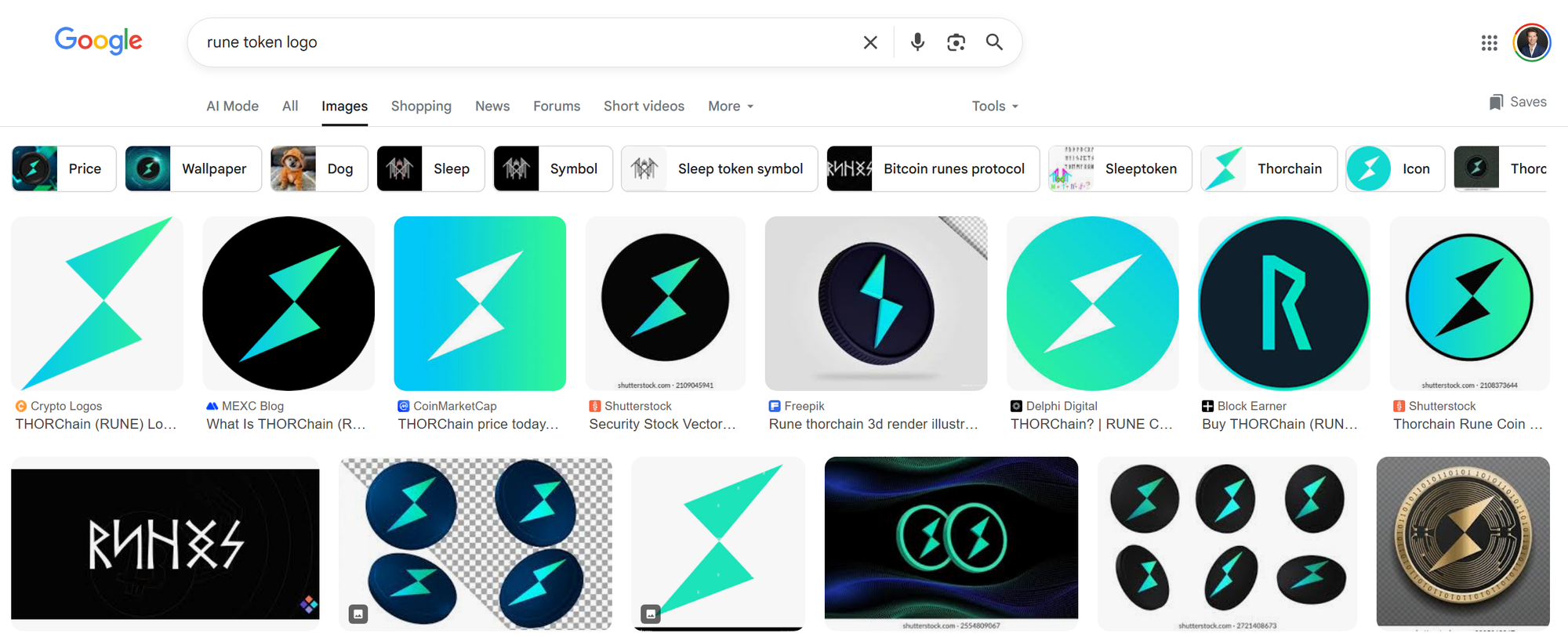
If you google search images for “rune token logo” you’ll find the lightning bolt comes up most often. The runic “R” symbol rarely comes up. The lightning bolt is the main, most commonly used logo for THORChain. Most platforms that have THORChain listed, use the lightning bolt logo.
Current Logos
Here are the current logos used by THORChain. All three are completely different.
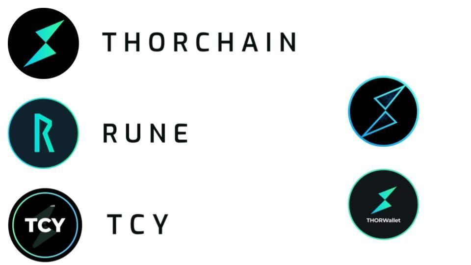
Someone who has never heard of THORChain before would view the three logos as three different projects. There’s no similarity between them. However, notice the THORSwap and THORWallet logos. They do look similar to the THORChain logo, which contributes to those projects being conflated with THORChain.
Instead of running away from the lightning bolt logo, we should run towards it.
The logo for Ethereum is the same as the logo for ETH. The logo for Solana is the same as the logo for SOL. The logo for a blockchain is the same logo for the gas token. The lightning bolt logo for THORChain should be used for the RUNE token, and in turn the TCY token.
Proposed Logos
THORChain doesn’t need to be rebranded. It just needs to clean up its brand. To organize and refresh it. Before tearing down the house, let's try a fresh coat of paint.
Here are the new proposed logos for THORChain.
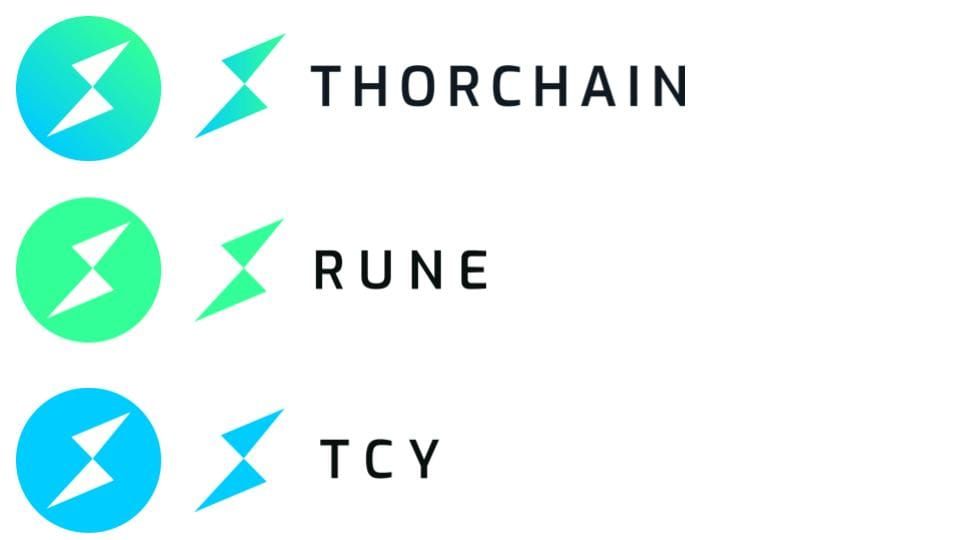
You’ll notice the THORChain logo is the same as before. The circle and lightning bolt have already been in use for a long time now. It’s just the RUNE and TCY tokens that are proposed to change.
The RUNE green and TCY blue are the same green and blue colors from the main THORChain logo. Through the use of color one can visualize that RUNE + TCY = THORChain. It doesn’t have to be explained.
The lightning bolt demonstrates all three are related. This makes it easy for someone new to THORChain to understand.
The use of color also moves us away from using black. The black background on the thorchain.org website can be perceived as nefarious or shady. Therefore, the new site is going to have a white background to convey trust and safety. On a white background the black logos don’t look good, the colored ones look better. Those who still want some distinction from THORSwap and THORWallet will get it with these colored logos versus their black logos.
The blue and green colors are a big part of the THORChain brand. They’re what THORChads use on their profile rings.
These logos are also simple. On most websites, the actual size of the logo you see is quite small. Therefore the logo has to be simple in order for it to be recognized at a small scale. The color helps them pop out when used on a black background too.
Small changes like this are what we can do as a light rebrand, instead of doing a full rebrand.
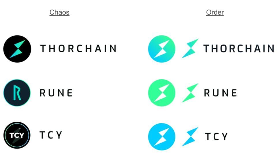
Chaos ~> Order
If there’s anything that needs to be rebranded, it’s the chaos.
The current logos being completely different from each other are a symptom of the chaos that everyone wants to move past.
The consistency between the new logos communicates order and harmony.
Let us know what you think about these logos. Even if you’re indifferent, let us know so we have an idea where the community stands before moving forward with these. If we have constructive feedback on changing them, we can try it and share those with the community.
Please give feedback or ask questions in the marketing channel on the Dev Discord.
Thank you
– – – – – – – – – – – – – – –
Swap now 👉 swap.thorchain.org
Official website 👉 thorchain.org
🔽 Follow THORChain 🔽
X (Twitter) / LinkedIn / Reddit / TikTok /Instagram / Facebook / Blog
🔽 Join the community 🔽
Telegram / Discord / Discord (Developers)
– – – – – – – – – – – – – – – – –