Introducing boone.tools: A Better Way to Understand THORChain

2026-10-05 — 10 min read
- SpotlightGuide
THORChain has a large amount of data available onchain, but understanding what that data means is not always easy.
boone.tools was created to solve that problem. The site brings together a growing collection of dashboards covering THORChain’s pools, Protocol-Owned Liquidity, node votes, the App Layer, network economics, and several other parts of the protocol.
The goal of this is to make the state of THORChain easier to understand so that the people participating in the network can make better-informed decisions.
Why Boone Built boone.tools
Boone is a long-time THORChain community member and contributor who has become increasingly involved in the protocol's development. He has contributed to discussions about THORChain's economic model, including advocating for Protocol-Owned Liquidity and the removal of block rewards. More recently, he has been working on THORChain's Monero integration, developing the core proof of concept for connecting Monero to the network.
His motivation for creating boone.tools came from a simple problem. Whenever he wanted to investigate something about THORChain or verify a particular claim, he often struggled to find the necessary information in one place. Instead of repeatedly collecting the same data, he started building tools that could track it automatically.
As Boone explained during our interview, "I either want to know something or I want to show someone else something." This curiosity has been the driving force behind boone.tools, with each dashboard addressing a specific question about the protocol.
Interestingly, Boone never intended to build an entire analytics platform. It started when he experimented with building a dashboard to track THORChain's newly introduced Rapid Swaps feature. After sharing it with the community, people began requesting additional tools, and the project gradually developed into a much larger collection of dashboards.
Even the name came about organically. Boone drew inspiration from the existing community analytics platform rune.tools, which had made its source code publicly available. He used that project as inspiration for his own dashboards and named his platform boone.tools as a playful reference to rune.tools.
Today, boone.tools helps community members better understand THORChain by providing direct access to information about the network's activity and economics. This is especially valuable for a decentralised protocol where Nodes are responsible for making important decisions about how the network operates.
By making this information more accessible, Boone hopes to give community members a shared factual basis for discussions about THORChain's future. While participants may disagree about which direction the protocol should take, they can use the underlying blockchain data to better understand its current state and make more informed decisions.
Explore THORChain Through boone.tools
boone.tools has gradually developed into a collection of 16 specialised dashboards, each designed to help users understand a different part of THORChain.
The dashboards range from Status, Rapid Swaps, Pool Analysis and Financials to tools tracking Protocol-Owned Liquidity, RUNE burns, Node bonds, vaults, the Treasury, dynamic fees, governance and App Layer activity. Other dashboards include TC Fee Dash, Pool Dislocation, POL TVL, POL Tracker, Burn Tracker, Bond Tracker, Vault Explorer, ADR26 Dynamic Fees, Vote Tracker, App Layer / Base Layer, and Briefings.
Together, they provide a much more detailed view of what is happening across THORChain, from network health and swap activity to liquidity, protocol finances and governance.
Covering all 16 tools in detail would quickly become overwhelming, so we asked Boone which metrics he considers most useful when analysing THORChain. He highlighted the following five metrics that he considers to be the most important.
1. Pool Analysis
The Pool Analysis dashboard gives users a detailed look at how THORChain's individual liquidity pools are performing. Boone originally built it because he wanted to understand which assets were responsible for generating the protocol's trading volume and revenue. Although this information was available through different sources, there was no single place where he could easily compare the performance of individual pools.
For each pool, users can compare its internal price with an external oracle price, see its liquidity depth, and examine the underlying asset and RUNE balances. The dashboard also tracks trading volume and liquidity fees across different periods. Users can sort pools by these metrics to identify which assets are generating the most activity and revenue.
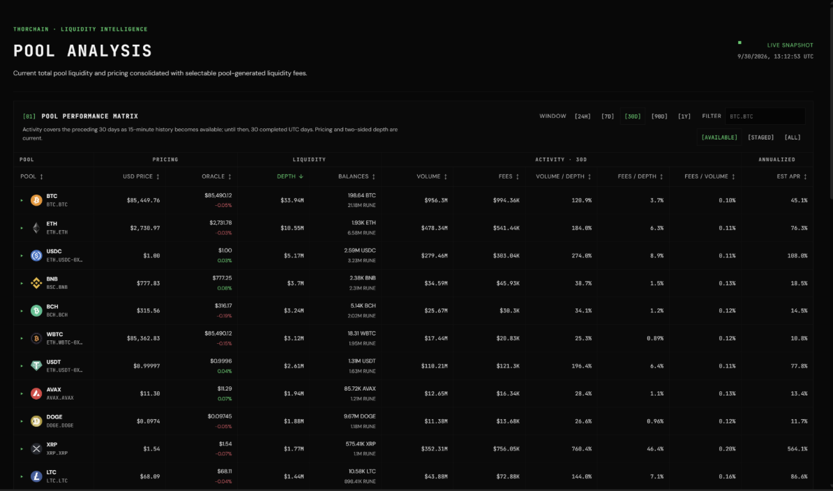
One of the most useful metrics is fees relative to pool depth, which Boone considers an important indicator of capital efficiency. It shows how much fee activity each pool generates relative to the liquidity available. This information has become particularly relevant with the introduction of Protocol-Owned Liquidity (POL), as the protocol uses fee generation relative to liquidity depth as part of its process for determining where additional liquidity should be allocated.
Users can also select individual pools to examine their historical performance. The dashboard provides charts showing daily trading volume, daily fees, cumulative fees, and changes in pool depth over time.
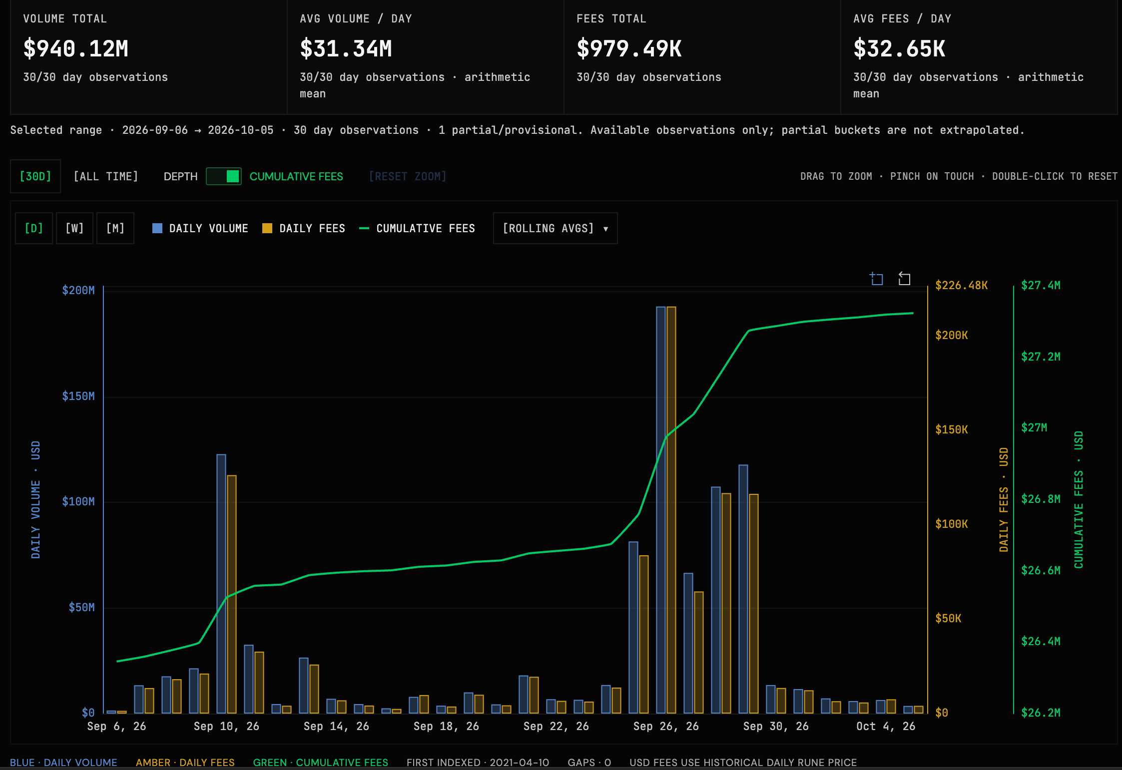
These historical comparisons make it possible to identify how liquidity and trading activity develop within individual pools. For example, users can examine whether a pool has attracted additional liquidity or whether its capital efficiency has improved over time.
As Boone explained during our interview, Pool Analysis is one of the dashboards he checks most frequently himself. It gives him a straightforward way to understand which assets are generating revenue and how efficiently THORChain's liquidity is being used.
2. POL Tracker
The POL Tracker focuses on THORChain's Protocol-Owned Liquidity and how the protocol builds and manages its own positions in liquidity pools.
Boone has been one of the strongest advocates for POL within the THORChain community. He believes that allowing the protocol to build its own liquidity addresses several important problems, including its historical dependence on the independently managed Treasury to provide liquidity for new and existing pools.
As Boone explained during our interview, POL allows THORChain to build a liquidity base that it controls itself. This reduces its reliance on external liquidity providers and gives the protocol a mechanism for directing additional capital toward pools that need it.
The POL Tracker provides the data needed to follow this development. Boone considers the current value locked in POL its most important metric. Alongside this figure, the dashboard displays how much RUNE has been deposited through the mechanism and how that capital has been allocated across individual pools.
Users can examine POL's positions, its ownership share within individual pools, and how deposits have developed over time. Another important metric estimates POL's share of the liquidity fees generated by the pools in which it participates. However, Boone emphasised that this figure requires some interpretation.
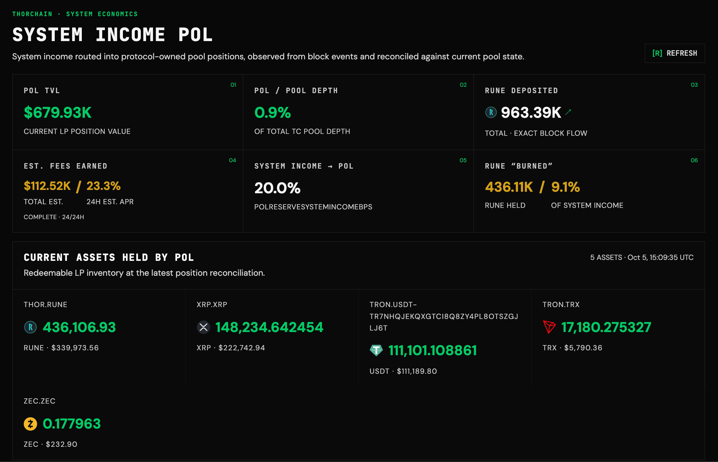
Simply attributing fees according to POL's ownership share does not necessarily mean that POL was responsible for generating those fees. Some swaps would have taken place regardless of whether the protocol had provided additional liquidity.
The purpose of this calculation is therefore to illustrate POL's potential contribution to THORChain's economics. By providing deeper liquidity, POL can improve swap execution and potentially attract additional trading activity. This creates the possibility of generating more revenue that can subsequently be reinvested into liquidity.
The dashboard also includes a metric that treats RUNE deployed through POL as effectively removed from circulation. Boone emphasised that this is not a conventional token burn. The RUNE remains within liquidity pools, and its balance can change as market prices fluctuate.
Together, these metrics allow users to follow how POL develops and evaluate its potential contribution to THORChain's liquidity and long-term economic sustainability.
3. Cross-Chain Competitors
The Cross-Chain Competitors dashboard compares THORChain's economics with competing cross-chain trading systems, including Chainflip and NEAR Intents. Boone developed this comparison because he believes that trading volume alone provides an incomplete picture of how successfully a protocol is performing.
A protocol can generate significant trading activity while spending substantial amounts on token incentives to attract users and liquidity. Consequently, higher trading volume does not necessarily translate into a stronger economic model. To account for this, Boone's dashboard compares the protocols using a straightforward calculation: profitability = fees − token emissions.
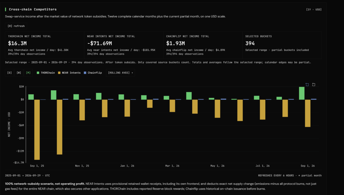
This distinction is especially important when comparing THORChain with NEAR Intents. Although NEAR Intents has periodically generated substantially more trading volume, Boone argues that its economic performance looks very different once token emissions are taken into account. THORChain, meanwhile, operates with virtually no ongoing token emissions, allowing it to retain considerably more of its income under this methodology.
During our interview, Boone explained that his dashboard has generally shown THORChain generating substantially more net income than its competitors. The comparison helps illustrate why trading volume alone is insufficient to evaluate the economic sustainability of different cross-chain protocols.
It is important to recognise that this calculation does not represent each protocol's complete operating profit. Instead, it provides a consistent framework for comparing swap-related income against token subsidies, helping users understand which protocols generate revenue without relying heavily on continued token issuance.
4. Vote Tracker
The Vote Tracker makes THORChain's onchain governance activity more accessible by providing a detailed overview of Node voting.
THORChain Nodes use Mimir votes to change many of the parameters that determine how the network operates. These include economic settings, transaction fees, chain configurations, and operational parameters.
Before developing the dashboard, Boone found that understanding ongoing votes and their current status could be unnecessarily difficult. Although some information was available through Discord and existing tools like rune.tools he wanted to provide a more detailed overview that allowed users to examine voting activity directly.
The Vote Tracker provides three main views. The first organises voting activity by parameter, showing which Nodes have voted, their proposed values, and how many additional votes are needed for a change to take effect. Users can also examine historical votes and see when parameters were actually updated, such as when Nodes voted to enable or disable Bitcoin trading.
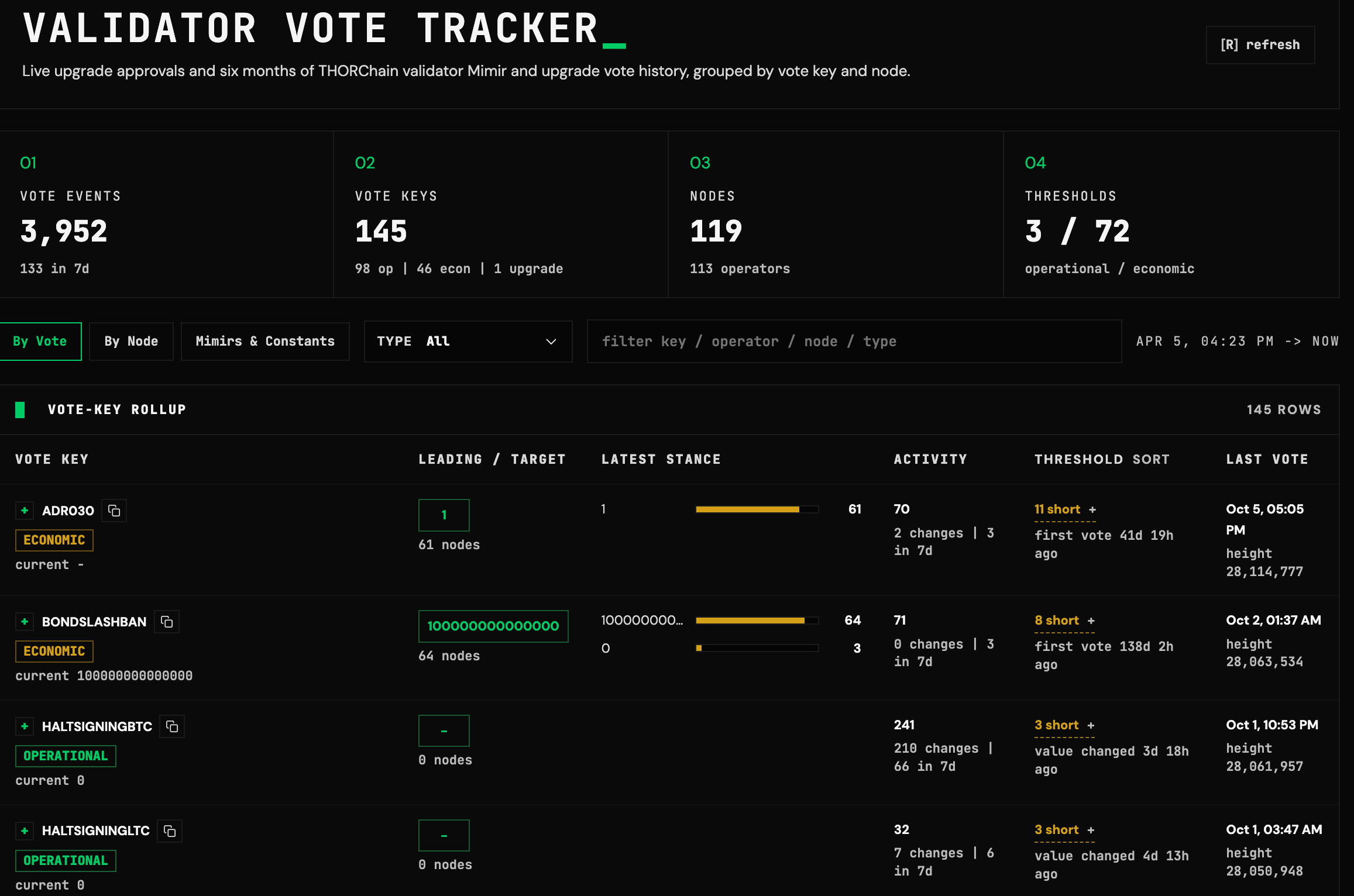
The second view focuses on individual Nodes, allowing users to examine their voting history and average response times. This is particularly useful for bond providers who want to understand how actively Nodes participate in governance and whether their decisions align with their own preferences.
Finally, the dashboard provides a searchable overview of THORChain's current Mimir values and network constants, giving users easy access to the network's operating parameters.
5. App Layer / Base Layer
The App Layer / Base Layer dashboard tracks how economic activity generated by the Rujira App Layer contributes to THORChain's underlying network. It provides an overview of how funds move between the two layers and displays the cumulative value transferred to the Base Layer.
The dashboard distinguishes between two sources of revenue. The first consists of fees generated when App Layer transactions use THORChain's Base Layer infrastructure, which contribute to System Income. The second consists of revenue generated directly by App Layer applications and subsequently shared with THORChain's Protocol Reserve.
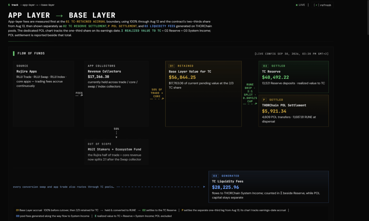
As Boone explained during our interview, these revenue streams are distributed differently, making it important to track them separately. The dashboard also distinguishes between revenue generated and funds actually transferred to the Base Layer, as some revenue accumulates in a contract before being distributed gradually over time.
Finally, the dashboard tracks funds allocated to App Layer POL, which operates separately from THORChain's Base Layer POL mechanism. Together, these metrics give users a clearer understanding of how App Layer activity generates revenue, how that revenue is distributed, and how much economic value ultimately reaches different parts of THORChain.
A Better Way to Understand THORChain
boone.tools makes it easier to understand what is happening across THORChain without having to piece together information from different sources.
The dashboards give users a clearer view of how the network is performing and how different parts of the protocol are developing over time. This is especially useful for a decentralised network like THORChain, where many important decisions are made by Node Operators.
Better access to this information will not mean everyone agrees on what THORChain should do next. It does, however, give the community a stronger basis for those discussions and makes it easier to make decisions based on what is actually happening onchain.
Explore boone.tools at https://boone.tools .

Related articles
![THORChain's System Income distribution, with 20% now directed to Protocol-Owned Liquidity and the RUNE burn reduced to 1%.]()
Sep. 23, 2026
How THORChain’s New System Income Distribution Works
- Guide
![Illustration of THORChain's Protocol-Owned Liquidity system, showing System Income flowing into deeper liquidity pools.]()
Sep. 21, 2026
Why Protocol-Owned Liquidity Matters for THORChain
- Guide
![How to Swap Crypto on THORChain thumbnail, a THORChain guide]()
Sep. 18, 2026
How to Swap Crypto on THORChain
- Guide
![NanoGPT and THORChain branding together, representing NanoGPT's accountless AI model marketplace settling crypto payments through THORChain.]()
Sep. 16, 2026
Protocol Spotlight - NanoGPT
- Spotlight
![THORChain Thumbnail for the 2026 guide comparing ten decentralized exchanges across cross-chain support, fees and MEV protection.]()
Sep. 10, 2026
The 10 Best Decentralized Exchanges (DEXs) in 2026
- Guide
![Thumbnail for THORChain guide explaining how the Advanced Swap Queue and slip-based fees prevent sandwich attacks on swaps.]()
Sep. 7, 2026
How THORChain’s Swap Queue Prevents Sandwich Attacks
- Guide
![THORChain guide thumbnail explaining how to bond RUNE through direct whitelisting, RUNEBond and bRUNE liquid staking, with yield and risk comparisons for each method.]()
Sep. 2, 2026
How to Bond your Rune: a practical guide
- Guide
![THORChain Protocol Spotlight thumbnail for BazaarSwap covering cross-chain aggregation across 360 exchanges, native asset routing and THORChain's role as a core liquidity provider.]()
Aug. 31, 2026
Protocol Spotlight - BazaarSwap
- Spotlight
![THORChain Protocol Spotlight thumbnail for depouch covering native cross-chain swap routing, THORChain integration and permissionless liquidity access.]()
Aug. 14, 2026
Protocol Spotlight - depouch
- Spotlight
![THORChain guide thumbnail showing how to perform a cross-chain swap without connecting a wallet, using the Walletless Swap feature on swap.thorchain.org.]()
Aug. 12, 2026
How To: Walletless Swaps
- Guide
![THORChain Protocol Spotlight thumbnail for Rango Exchange covering cross-chain aggregation, native asset routing and THORChain's role in Rango's liquidity infrastructure.]()
Aug. 11, 2026
Protocol Spotlight - Rango Exchange
- Spotlight
![THORChain is transparent even with privacy coins thumbnail.]()
Jul. 21, 2026
THORChain Is Transparent Even With Privacy Coins
- Guide
![THORChain Community Podcast #198 thumbnail featuring JP and Kenton demonstrating the first live decentralised RUNE to Monero swap on THORChain's chainnet.]()
May. 14, 2026
JP Demos Live Monero on THORChain: 7 Nodes, Real Funds, First Swap Works
- Podcast
- Guide
![]()
May. 4, 2026
Bior Labs Cards Are Imminent: Bill Pay, $10K Virtual Cards and a Stablecoin Alpha
- Spotlight
![]()
Apr. 27, 2026
Unstoppable: The Best Privacy Wallet – THORChain Mobile Interface
- Spotlight